Buy
Archive Posts

Overview

The Archive Posts Widget displays list of any posts within archive templates with all sorts of customization. 

Screenshot

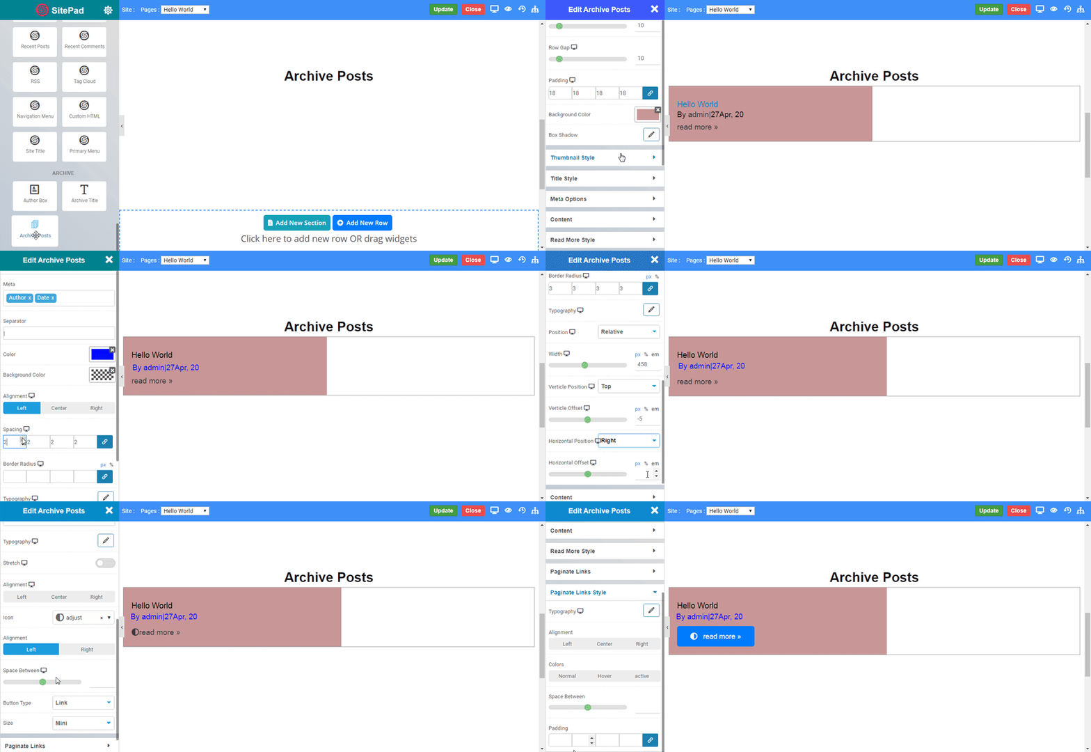
The following is a GIF video to show you how to use the archive posts widget and the various options available :

Archive Post

Options

Archive Posts

  • Type : Select type of posts.
  • Column Select number of column wanted in a row.
  • Columns Gap : Set gap between columns.
  • Row Gap : Set gap between rows.
  • Padding : Set padding of post box.
  • Background Color : Set background color of post box.
  • Box Shadow : Set shadow of post box.

Screenshot

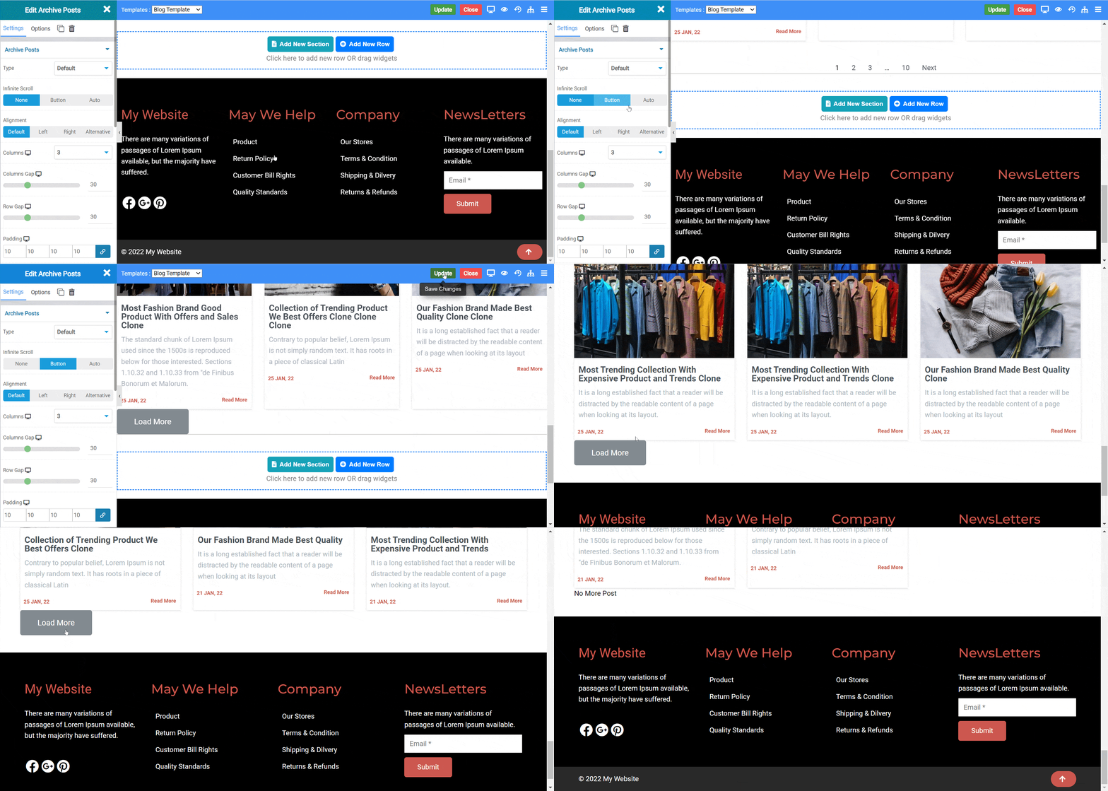
The following is a GIF video to show you how to use the Infinite scroll features.

In the Infinte Scroll there are two types.

  • Button : When Click On load more button.It will load the new Blog post are available.
  • Auto : It will Automatically load new blog post when we will reach at end of page.
NOTE -To understand more about how to use infinite scroll please CLICK HERE.

Thumbnail Style

  • Show Title : Toggle to display post title.
  • Color : Set color of title.
  • Typography : Set the font and text style of post title.
  • Top Bottom Spacing : Set space around post title.

Meta Options

  • Meta : Set extra details of posts.
  • Separator : Set any separator between meta details.
  • Color : Set color of meta details.
  • Background Color : Set background color of meta details.
  • Alignment : Set alignment of the meta details.
  • Spacing : Set spacing around details.
  • Border Radius : Set radius of the border.
  • Background Color : Set background color of meta details.
  • Typography : Set the font and text style of meta details.
  • Position : Select position type of the meta details.

Content

  • Show Content : Select any extra content to show.
  • Color : Set color of content.
  • Padding : Set padding of content.
  • Alignment : Set alignment of the content.

Read More Style

  • Show : Toggle to show read more option.
  • Text : Set text of text extending option.
  • Typography : Set the font and text style of read more text.
  • Alignment : Set alignment of read more.
  • Icon : Set icon in read more.
  • Alignment : Set alignment of read more icon.
  • Space Between : Set space between text and icon.
  • Type : Select the styles of buttons to begin your design. Choose from Primary, Success, Info, Warning, Danger etc. If you want to design your own button from other than these options then select Custom from the drop down, after selecting the custom you will get the option State in which you can design the button in Normal and Hover State.
  • Size : Select the Size of button, default is selected to Mini. Choose from Mini, Small, Large, Extra Large, Double Large. If you want to give size to your own button from other than these options then select Custom from the drop down, after selecting the custom you will get the input State in which you can give any size but it should be less then hundered.
Paginate Links

  • Pagination : Select type of pagination.
  • Pagination On : Set location of pagination.
  • Previous Text : Set previous link text.
  • Next Text : Set next link text.
  • Pagination End Size : Set end numbers value of pagination.
  • Pagination Mid Size : Set mid numbers value of pagination.
  • Before Page Number : Set text display before page number.
  • After Page Number : Set text display after page number.

Paginate Links Style

  • Typography : Set the font and text style of pagination number.
  • Alignment : Set alignment of pagination number.
  • Space Between : Set space between text and icon.
  • Padding : Set padding of content.

Colo

  • Color : Select the state in which color effect has to be display viz. Normal, Hover or Active.
  • Color : Set the paginate color.
  • Space Between : Set space between text and icon.
  • Padding : Set padding of content.
    Was this page helpful?
    Newsletter Subscription
    Subscribing you to the mailing list