Overview
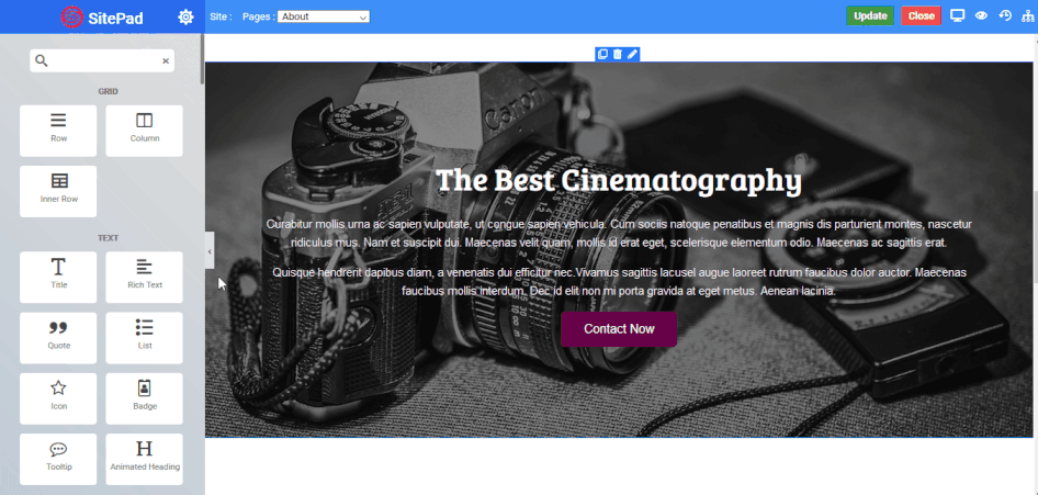
Columns Widget
are an extremely important part of the page building process. They are
containers that allow you to place any element, widget or content inside
of them.
They allow you to separate and organize content with ease. The intuitive
interface allows you to easily adjust the column size on the fly with
just a click. Creative design depends on columns and the options they
offer, they allow you to insert background images, colors, borders,
border styles/colors/ sizes, border positions on any size, column
animations, control the overall gutter width between columns down to the
exact amount you desire, add column links, hover effects and more. In
addition, column widths automatically adjust the size based on the
overall site width.
Content
- Content V-align : Set the vertical alignment of an element inside the widget eg- Default, Top, Center, Bottom.
- Widget Space : Set the space between each widget you use inside the column.
- Column Width : Set the width of the column from 1 to 12 or provide your custom width.
Background
- Background Type : Choose the background for column eg - None, Video, Parallax.
- Video URL : Set the column background to your choice of video.
Overlay
- Delay : Set the time it takes to appear. This time is in milliseconds, so 1000 ms is equal to 1 second.
- Overlay Type : Choose the type of overlay for column eg - None, Color, Gradient, Image.
Color Overlay
- Color : Choose the overlay color for the column.
- Transparency : Set the transparency of the overlay type.
The following is a screenshot to add a Color Overlay :

Image Overlay
- Image : Select the image you want to display as an overlay.
- Attachment : Set the image attachment type eg - Default, Scroll(Scrollable), Fixed(Parallax).
- Position - X : Set the horizontal position of image for overlay eg - Default, Center, Left, Right.
- Position - Y : Set the vertical position of image for overlay eg - Default, Center, Top, Bottom.
- Repeat : Set the overlay image to repeat itself if space is available eg - Default, Repeat (image will be repeated horizontally and vertically as per available space) , No-Repeat (image will not be repeated), Repeat-X (image will be only repeated horizontally), Repeat-Y (image will be only repeated vertically).
- Size : Set the size of the overlay image eg - Cover (image takes full available space), Contain (actual size of the image not exceeding column size)
- Transparency : Set the transparency of the overlay type.
The following is a screenshot to add a Image Overlay :

Gradient Overlay
- Angle : Set the angle of the gradient color to be displayed from 0 to 360 degree.
- Color 1 : Choose the first gradient color.
- Percentage : Choose the percentage of the first gradient color to be displayed.
- Color 2 : Choose the second gradient color.
- Percentage : Choose the percentage of the second gradient color to be displayed.
- Color 3 : Choose the third gradient color.
- Percentage : Choose the percentage of the third gradient color to be displayed.
- Transparency : Set the transparency of the overlay type.
Note
The following is a screenshot to add a Gradient Overlay :
